Wednesday, May 29, 2013

2+ Hours with Bioshock 2

Bioshock 2

Being a Big Daddy

http://gamefiles.alphacoders.com/fanart/original/649-9.jpg
I was able to play Bioshock 2 for a few hours. I tried the first game a while ago. The horror-ish aspect, minimal resources to manage efficiently, and abilities were cool but the main character being human made the game feel odd to me. How was he expected to survive in such an environment? I like games where there is definitely a challenge and the sense of uncertainty but also the sense of being powerful.

Bioshock 2 has a much different feel from the original. The original set the pace and tone of the magic circle that was the retro world but the gameplay was lacking some mechanics and consistencies. In Bioshock 2 the player is a Big Daddy that is unique and out on his own agenda. 

As a Big Daddy you feel powerful but not unstoppable since there are other newer models of Big Daddies and the introduction of Big Sisters. The same mechanic of managing limited resources, such as ammunition, health, energy, and the like is still essential to survival in the second game.

The "magic" ability mechanic feels much less tacked on in this game and more essential. It is also more consistent with your character wince you are clearly a person who has been through a lot of experimentation and experiences in this crazy undersea world. You can increase the power of abilities, health, hacking skills, and other traits through adopting little sisters from other Big Daddies that you defeat. While the challenge of fighting them can be hard and use up a lot of valuable resources, the coherent reward is always worth a successful fight with another Big Daddy.

Little Sisters can be harvested for a set amount of ADAM to upgrade your abilities right when you kill their companion Daddy or you can adopt it and have it harvest more ADAM. This is one of the many decision trees within the game that make the outcome of the game uncertain the the challenge vary. After choosing to save a sister and harvest more ADAM you will have to fight off waves of Splicers (type of drug user in Bioshock world) and any other enemy that wanders by. After collecting more ADAM from two bodies you again have a choice: Save the little sister or harvest her for even more ADAM? I have not played enough to know the reward or punishment for saving little sisters but the extra ADAM is very handy so it should be something significant if the player sacrifices such an oppertunity.

Other decisions in the game are attached to the plot. Like deciding to let someone live or die that has been hindering your progress and trying to kill you for the beginning of the game. At first saving someone may seem almost meaningless but later they may be grateful and in such a tight space underwater, connections are good to have. Other decisions are more minor, such as deciding to hack a camera to use for your own defense or just destroy it and save the hacking dart since it is a valuable resource.

http://www.slashgamer.com/wp-content/uploads/2009/08/2bigsister2.jpg  (Big Sisters) 

The introduction of the new enemies known as Big Sisters is a very cool development for the series. They are much faster than Daddies and have a similar aesthetic. They are just as irritating to fight but in a different way. I used a similar amount of resources fighting a Big Sister as I did a Big Daddy because I missed my shots too often where as the Daddy would take more damage.

The retro Steampunk-esque world is very intriguing. I am excited to play more. The controls are relatively simple and intuitive and the item management is straightforward, which is very good for a game where resources are scarce and very useful. I am glad this game universe has expanded to things like Bioshock Infinite and will explore more Bioshock soon.

2+ Hours with Borderlands 2

Borderlands 2


After the first Borderlands, I knew I would someday get the second. I loved the first game. It appealed to the Achiever and Adventurer gamer in me. Free range of the land (of open lands that is) and the ability to collect, sell, and continually find new weapons and accessories.

Borderlands 2 feels a lot like an extension of the first game. The classes to chose from at the beginning are new from the old ones and the enemy is different, he is after "Vault" hunters (which you happen to be). Your objectives are to survive, complete missions for money/story progression/experience, and collect newer and better weapons as you beat harder and harder foes.

The open world of Borderlands 2 feels like it improves upon the first game in the series. The monsters feel more natural and aggressive, map design limits backtracking (as does fast travel locations), and overall the experience feels even more immersive than the first, which seemed to rely more on the visual aesthetics being the experience than the second game of the series.

The characters in the world are fun and lively thanks to their creative direction/mature concept and their creative voice acting. While the quests they give you are relatively typical of an RPG (go kill this many of these, get a reward) there are often enough quests that tie into the lore of the world and that add to the complexity of the bock-story.

But I'm not a fan of the game solely for the back-story, the looting and treasure hunting is the biggest draw of Borderlands. In Borderlands 2, the weapons are new and unique compared to the earlier game. There are always some new awesome finds of weapons that are rare and do a lot of damage in ways other than just physical bullet damage, some of the best weapons I got in m short playtime were corrosive damage based weapons and explosive pistol round weapons.

While the loot IS awesome, the inventory problem from the first game persists. It is part of the limitations of game-play that the player can only carry so many items at certain levels but it makes it very hard to tell what weapons to pick up and try out, price and rarity don't always tell the whole story about how effective a weapon may be for your character.

Enemies seem harder in Borderlands 2. This is not a big deterrent because fast travel and vehicles make up for some lost time when defeated by a horde of enemies or an unfortunate hit to the head.

The HUD (heads up display) while playing is pretty minimal, at least in the PC version I was playing. I think it feels very clean while providing valuable information. The only problem I have with it is that it is not always obvious that your shields are low or gone, with a better indicator on screen it would help to warn players to take cover (if possible, not always likely in Borderlands).

The leveling system in the game feels a little slow and somewhat insignificant. the powers feel like a secondary mechanic and not necessary to play through effectively,, though I may be too early in to tell.

I really enjoy the vast world and various AI interactions. I look forward to see how the game mechanics develop as the game progresses. Right now all I can say is I enjoy finding the new weapons they added from the original set in the first game and the world feels just as unique.

1.5hours with Knytt Underground on PS3

Knytt Underground
1.5hours
Free for PlayStation Plus Subscribers

http://insideplaystation.com/wp-content/uploads/2013/05/Knytt-Underground.jpg
Knitt Underground was free for PlayStation Plus subscribers in a recent week. I had no interest in buying it before and knew little about it but since I was able to get it for free I decided to try it out on my PlayStation 3.

Knitt is a 2D side scrolling game that is visually interesting. The design focuses on light to show path areas. Black is areas of the "underground" that are typically not traverse-able. The very vibrant backgrounds are nice but do not disguise the level design to me, it is much nicer than a simple 2D or simplistic 3D plane in the background though. It gives a strange sense of space and scale to the underground world that is the magic circle for Knitt Underground.

The very beginning of the game starts with no menu screen or instructions, you have to traverse a small area to get to the screen pictured at the top of this blog post. The next screen to the right lets the player chose a chapter (I believe there are 4) and a couple other areas of game exploration.

I entered the first chapter and the core mechanics became very apparent quickly. Since this game is a 2D sidescroller, Movement is a key mechanic. Timing jumps, landing jumps, exploring the land, and climbing walls deliberately are all key movement related actions in the game that the player needs to succeed.

There are some glowing orbs in the world that when picked up can be used within a short time limit to use a magic ability. These abilities are often movement based, such as "move linearly in this direction until the character hits a wall/surface in a section of the map".

Enemies are simple enough and have very readable patterns. They feel like part of the puzzles, much like in Zelda games.

The character moves relatively fast and most surfaces are climbable, this combination lead to a lot of accidental wall climbing, which got frustrating. This could in part be related to my use of a new 3rd party controller I purchased for my system.

There is nice ambient music in the game, it is relaxing and changes with the environments. My problem was that the music made my mind wander and I began to get tired relatively early on in gameplay. There is no voice acting or noise-voice substitutes, it is all text. The text is relatively short and digestible.

The game seems to be great for people who enjoy platformers/2D side-scrolling games. Explorer type players will enjoy how free the world feels despite its constraints.

In order to unlock doors (they look like totem poles) the player collect parts from temples and/or complete tasks for people in the game world. The puzzles, treasure seeking, and map exploration all reminded me of older Zelda games. Other elements reminded me of Megaman. This mix is popular among a decently sized target audience, but personally it is not my forte.

Some Minor Pitfalls:
-Some solid black areas can be walked behind, making it hard to guess where to go, even with the map open. but this adds to the explorer aspect of the game and feels somewhat old-school.
-dramatic elements/back-story are not always clear and coherent.
-decent amount of backtracking with little else to find the second time through with such a simple world design.
-can be overly mind-numbing/repititious.

Nice Elements:
-beautifully simple world.
-nostalgic.
-geeky/nerdy.
-freedom to chose open paths.
-puzzles/movement puzzles.
-hints to secondary things and pathways that can't be easily seen (water dripping for example).

-Will N.

Tuesday, May 28, 2013

2Hours with The Witcher

The Witcher

2 Hours with an RPG

Lovely Aesthetic World

I decided to try out The Witcher. I was tempted to play the sequel for this review but decided that the first is a better starting place for someone new to the game and I knew I could only do so much in an RPG with such a short playtime. It best to not play RPGs and expect to know their systems within an hour or two but I was excited to try this game and I knew I could get a sense of some of the mechanics in the short amount of time I had to play.

One of the things that these game reviews has made me appreciate more is the opening videos of games. They can help give a sense of what is to come in the game, especially if you know you will be playing for a very limited time. The Witcher's opening cinematic is very comprehensive and helps to set the tone for the magic circle of which The Witcher resides. It does a good job of concisely stating that the overall dramatic elements of the game.

At the beginning of the game you are allowed to chose the "Game Mode". While this can be nice for replay value, terms like "The Witcher" and "New Adventurers" doesn't explicitly tell me anything about either mode, especially since I interpreted them as "The Witcher Narrative" and "New Adventure Type Players (who perhaps still want the Witcher Narrative?)". I would have liked a little more insight, but I chose "The Witcher" since I assumed that would be less free-form and better for time constraints.

It is nice that you also get to chose whether to use the mouse and keyboard or just the mouse for controlling the character. It reminds me of StarCraft II. While a player can control most everything with the mouse,thanks to an elegant solution to SCIIs plethora of interface controls, it is less efficient and less enjoyable but easier in terms of learning curve. I chose to use both keyboard and mouse. I am not looking for a point and click 3D game on my PC most of the time.

Voice acting is not so great, it can break the experience for me from time to time but the world is still immerse.

Relatively Compact HUI (1080p)
Most on screen actions are hidden and rely on the "click to interact" mechanism, which reduces on-screen GUI clutter.

In combat there are different types of enemies. Some attack from a distance, some are quick, and some are slower and more powerful. The main character has multiple fighting stances to fight using different techniques to counter any type of enemy combat style. This mechanic intrigued me and I enjoy swapping stances to get critical stunning hits and hearing less metal clashing. If the right style is used against an enemy it is possible to get multiple strikes in against them and hit a timing with each strike which grants you combo attacks that are very important to taking down enemies much faster than longer one on one skirmishes.

There appear to be dungeons, so dungeon crawling is an element of the game. It definitely has appeal to both Achiever and Adventure type players, though I am not sure how much there is to venture out and find outside of the main plot, it is too early to tell.

The Witcher employs the use of a pause system when switching combat stances. It seems like a hard balancing decision for developers. I personally love it when they include the option to take a break and not make mistakes.

Some cut scenes could have been left out, they did not add to the atmosphere or magic circle. The auto pathing to clicked object is very good in this game, it seems some great coding and predetermined paths went into this. It helped to make movement a little less tedious and helped to emphasize combat and quest completion.

I accidentally skipped a scene that seemed crucial to understanding dramatic elements and conflict within the game but there seemed to be no reasonable way to re-watch it. It would be nice to have a "are you sure you want to skip?" text-box but that is perhaps a luxury I have been spoiled with. Because of the missed plot in the cut-scene, the plot felt less dimensional and I worry decisions I make will need information from what I did not hear. Granted, the chatter can be a little slow and the voices can be emotionally flat so I didn't miss too much socially.

After 1.5hours of playing I reached chapter 1... Which I had thought I was in! Combat has picked up a little and curing a fallen ally is one of my trivial tasks. unfortunately, I was unable to explore much more of the mechanics outside of the early game.

The game has a lot of potential, I just need to play past the first few hours. Though I can here the sequel calling my name...

-Will

Monday, May 20, 2013

2+ Hours of Game Dev Tycoon

Over 2 Hours with Game Dev Tycoon
Game Dev Tycoon Title Screen, TanGent is my company name.
A Game About Game Development... In a Sense.

 After reading about the interesting situation that Greenheart Games went through when releasing Game Dev Tycoon, I was intrigued. They released the game for sale on their site and on torrent sites around the same time, the torrent version slightly altered so that mid-game the players company would fail due to piracy for some nice irony. (http://www.greenheartgames.com/)

Since I am studying Game Development in school, I decided to buy the game and see what it was like. My hopes were low and my expectations were that it would be depressing. In the beginning of the game, you start out as a game developer in the early game era developing in your garage.

As the game goes on, you move out of your garage and establish a business location in a commercial building. This is done once you successfully create one hit game. While I am sure there is a formula for successful games, I have yet to figure it out with 3 or fewer people. It seems that you have to expand and keep squeaking by until later in order to figure out the hit games formula, perhaps I am mistaken though. There are few hints though. Trends and sequels seem to be the few guiding factors.

I obviously did not do so well with this #
The game lets you create your own games and balance game elements to try and make a great mixture that will sell well. You have to chose the audience, platform, game type, and style. Games are rated as you create them by a Technology score and Design score. Little bubbles/circles rise from above the developers heads and accumulate in a count at the top of the screen, as do bugs in the game and research points.

Each employee can also train to get better at design, technology, research, and speed. This takes some time, I am not sure how early on you are supposed to utilize this training since weeks go by very fase and every month you obviously lose money for operating costs. If you get too far in debt your company can get a loan or declare bankruptcy.

Below the sales on the right is the monthly costs/income

Despite spending so much time playing Game Dev Tycoon, I am not sure what I think of it. It is a little mind numbing. While I do enjoy it, it seems like it would be a better mobile/passive game since it is mostly waiting and making limited choices. The amount of player agency feels limited, there is no where to go and the timeline is very linear since it follows the gaming industry of the past. The control I have over the outcome of how a developed game does when I make it and release it. This may be to simulate the real market but taking control away from players is a risky choice.

I would need to spend more time with the game and play the end game section to know how it plays out, I am curious to see what happens after the current generation systems!


Tuesday, April 23, 2013

Dead Space 3 Game Analysis

Dead Space 3
On PlayStation 3


I'd like to start off by saying that I am not an avid Dead Space franchise fan. I have played a little bit of the first but never got interested in the game. I noticed that what I read about the latest installment of the game series was that it is geared towards a slightly different audience and it went on sale not too long after release so I decided it was worth purchasing.

Unfortunately, the PlayStation 3 does not have the feature of taking screenshots of games so any images I provide will be found online. Hopefully the PlayStation 4's Share feature will change that.

The main menu is somewhat neat for anyone who instinctively checks what controls do at the beginning of playing a game. There is an environment loaded around the menu that can be looked at by turning the perspective camera and looking around. A nice little interactive touch to the game.

The beginning of the game did something nice that a lot of franchises seem to ignore or do poorly lately, it recapped the overall plot of the previous games and the main character. This was very nice and appreciated by a player such as myself. It helped me feel incorporated into the Magic Circle that is the Dead Space universe faster than beginning the game and being like "What? Why is my character like this?"

After the initial plot recap the game begins and the first game play experience brought up a big point I need to address. I have played many games and understand generic controls for movement and actions so I can quickly pick up on how things work and the controller becomes less of an obstacle for game play. Dead Space 3 made the choice to not give any instructions on controls. Perhaps that is because I chose normal difficulty or because of the "horror" genre and the sense of adventure/figure it out yourself. I think it was a very odd choice and would be a huge turn off for new players. I found the controls to be a little abnormal but that is common for only 2 hours or less of game play. Still, little to no basic control tutorial is quite the decision.

It was nice because a crucial element of dark horror-based games such as this was addressed at the loading of a new game. The game brings up the brightness calibration when station a new game which I had already done but greatly appreciated the convenience of such an option, especially since the main menu animation made it unnecessarily slow to navigate from one menu to another.


The camera is in 3rd person, which is great for the genre, making you turn slower and aiming less efficient. The game rarely (if ever) leaves the 3rd person perspective which is very consistent and nice to keep you in the moment and the action visible. The story is very centered around the main character (Isaac) who you can always see.

The HUD is relatively out of the way and simple. Your health is displayed with a blue gauge on your suit that drains and changes color (the center vertical blue tube in the image above) and there is another gauge for your energy to the right of it. Ammo is kept tack of when you aim, it shows you how much ammo is loaded. Items to be acted upon have a pop up menu above them in blue that are simply "x" to activate or pick up. Terminals/benches/etc in the game are computers that are 3rd person as well and allow your character to interact with in-game computers.

I really like how unique the HUD is. I do feel a little frustrated in not being able to see my inventory/ammo quickly or being able to see a quantitative amount of health but it is worth it for the gained screen real-estate.

Again, a lot of the game is problem solving. Like with the controls, figuring out what something is or what to do in order to perform an action is all up to the players understanding of the game and game know-how. Some of the simple puzzles in the game (like re-attaching a train to its power car) was easy but satisfying. The game handled the complex issue of 3D space navigation relatively well. Look in a direction, hit a thruster button, go in that direction. It can get a little disorienting but it felt easy enough and I enjoyed it. It did not feel super limited in terms of where I could float.

The audience this game seems to be for is both achievers and adventurers. This is because there is some exploring of the world, though mostly linear. There are problems to solve and a few ways to solve them. And knowing how to do something is the best way to do it well (meta-gaming). This is especially true when it is not clear you are even controlling the character after a short cut-scene. Dead Space 3 also has Social oriented elements, allowing for co-op and multi-player.

Overall I enjoyed the beginning of the game despite its relatively steep learning curve and new universe (to me). I do wish at times things were clearer, such as when you controlled the main character. But at the same time, it's things like this that keep you on your toes and paying attention to what is happening. The emotional cut-scenes and flavorful Magic Circle intrigue me a lot, I am excited to play more and learn more about this universe.

Sunday, April 21, 2013

Soul Sacrifice

Soul Sacrifice
1.5 Hour Analysis
Title Screen

Loading Image on Game Load

 To start off, there is a couple of thing to mention about the game I played for this review. I was only able to play the Demo since it is not released in North America yet. BUT this is not ordinary demo, the save from this demo carries over to the full game. It is basically like the "60 minute full game" demo that Sony allows its Playstation Plus subscribers to do for select games. This means I got the full feel for the beginning of the game.

Quickly I must mention my resoning for playing the game. I am a little sad that Monster Hunter is not for the PS Vita, but this game is something better to me. The other reason I chose to review this game is because I have been looking for a beautiful mobile game that utilizes the new hardware power. As far as mobile games go... this game is beautiful.

Enough about that, on to the interface and gameplay. The core mechanic of the game is battle that is done against monsters of the Soul Sacrifice world. It feels relatively  unique. The controls appear simple on screen while some attacks have a second level of controls that appear when you enter the control for that ability.


Main Menu/Sorcerer's Journal/Librom


Inside of Librom

First Chapter in Librom

The main menu for the game is presented in the form of a book/journal that talks to you. Within the book are chapters that you relive as missions and they make you more powerful as you progress the story. This presentation for the main menu is very nice and intuitive. Simple choices on every page but enough pages that the depth many achievers may look for is there.

Assigning Abilities to Controls and Customization


The game is pretty linear so it is not necessarily a game for Explorers. There was no acting upon other players in what I played so it is not aimed at Killer type players. There is the option of playing co-op with other players so there is some Social aspects. Overall the game feels geared at Achievers. Every mission has a ranking and there are many object to unlock and improve. The quest system is pretty typical in what I played "Go kill this" seems to be the objectives in a nutshell. In this way the game feels similar to the Monster Hunter series.

The customization of your character impacts the quests you are given, which is nice since it becomes less of a fancy avatar and adds a little more depth with reason to choosing a class/character type.

Opening In-Game Cinematic

First Character You Meet In-Game Cinematic


Huge First Enemy In The Story


The game's universe is great an defined well. Thanks to the graphics and the intuitive presentation of the menu system, story, and the in-game cut-scenes all blend together and kept me in the "Magic Circle". The pacing and realism mixed with a mystical world also helped pull me into the game in a way all other mobile games have failed to do so far. This is what mobile RPG games on the PS Vita should feel like. The epic scale of some of the major enemies is also engrossing and makes the game feel relatively last in scale.

Sacrificing Skin

Choosing to Save or Sacrifice a Fallen Foe


A cool concept of the game that the designer used as a core inspiration, is the concept of sacrifice when choosing to gain an ability in battle. The only instance of an ability based on this concept I experienced so far is an ability that sacrifices the players skin for attack power, after which the defense of the player has dropped significantly. The more integrated way the concept is used is when going up to a defeated/fallen foe. You can chose to either strengthen your life by saving the enemy or strengthen your magic by sacrificing an enemy. This is instead of the traditional single leveling system. It makes the game feel more engaging and interactive when you have to make a choice every time an enemy is beaten. The choice is a little harder when it is a harder enemy since it will grant more experience to the side you chose than other minor enemies would.

Example of In-Mission GUI


When in a world fighting, the maps are relatively small. The GUI shows you everything you need to know. There is a map in the upper left, assigned abilities in the lower right, health/Level Gauges in the upper left, and a relatively smart camera that will aim your point of view at your targeted enemy.

I really enjoyed the game and its presentation. The interface is clean, simple, and designed for the 5inch screen it is displayed on. The story and world are immersing as well as beautiful. The concept of a game of Choices/Sacrifice is really intriguing and I will definitely be playing more of this game once it is released.

~Will N.

(All images are in-game screenshots of Soul Sacrifice on PlayStation Vita and property of their respective owners)

Sunday, April 14, 2013

Axis and Allies Analysis

 Axis and Allies
Board Game

The latest board game I have played is Axis and Allies. It is a board game that is like a reenactment/simulation of World War II. I believe the link below goes to Wizards of the Coasts webpage for the version I played.


The Board From Above, Early Game.

 A Better Perspective to See Some of the Pieces.

The board had each Power's (Axis/Allie) controlled lands color coded. Visually this was a good interface design for a decently large map where the number of areas controlled is a major factor of win/lose and determines the income at the end of every turn.

Every turn a player (we played in teams, as there were too many of us to play 1v1v1v1v1) determines what units to buy, then determines where to attack, players out the attack, does movements of units, places purchased units, then gains money based on the areas they control and the supply they provide.

These elements have an interface to keep track of each one well. The game provides a card to track the amount of money each power gets at the end of their turn. There is is another tracker to see which powers control what major cities. If Axis or Allies control more than a certain number of major cities than they win, that is one of the terms for winning. The other is after a number of turns whoever has the most control wins.

There is also some limits on the number of units that can be purchased, it is based on how many pieces are provided for each unit in the box. When a power purchases units they place them in a deployment area on the board until it is time to distribute them to the appropriate locations on the board. There is even a board for large battles where each power can put their units on one side for offense and the other power puts theirs on the defensive side as dice are rolled for combat. Since combat is somewhat complex without this visual area, it is very helpful to keep track of large battles.

Overall, it seems many things were thought about when designing the board. Evidence like unique unit pieces per power, deployment area, color coding, and unit limits are all evident of iterations of the game. They all help the game-play go smoothly and help players to not forget steps during their turn since every counter/area is specific for a part of the turn or winning terms.

To Be Continued...

Wednesday, April 10, 2013

Gravity Rush Analysis


Gravity Rush
(PS Vita)

A while ago, PlayStation Plus users were given Gravity Rush for free in the Playstation store. I tried it briefly when I first downloaded it but I did get sucked into the "Magic Circle" of the Gravity Rush universe.

If you are not familiar with the PlayStation Vita, it has a touch screen and a touchpad on the back of the device. It also has most of the typical PlayStation control scheme (minus the L2 and R2 buttons that are sometimes assigned to the back touchpad) and sixaxis motion sensing.


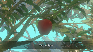
The first thing you are instructed to do in Gravity Rush is "tap the apple". It is a good use of the sixaxis motion sensing and touchscreen because as you move the vita around the point of view rotates around the apple with the different angles of the system. It had me worried that a gimmicky use of the touch screen was in store, but it was intuitive to tap the apple and watch it move based on my screen taps. Unexpectedly, you cannot just poke the apple to have the game begin. I had to tap a few times and slide my finger down the screen to get the apple to fall. It was not hard to figure out but a small instructional error, perhaps a translation simplification or I was tapping the wrong part of the apple.

The voices are the original Japanese voices, which is always fine but the subtitles can distract me too much sometimes in games. It is not too much of an issue for Gravity Rush because the pace is relatively slow for the text on screen.


The way the cut-scenes are done is a manga/comic-book style. It is done with multiple layers so that when the system is tilted the plane the images are on moves so there is some dimension to the images. I feel more immersed when I swipe the screen, like turning a page, to progress the story.

The game is very much on rails for the beginning portion and you cannot stray from the path. When story is being told the game takes all movement controls from the player and you have to wait until it tells you what is happening, sometimes this can feel a little dragged out.

The conflict of the game is between you and these dark creatures with glowing red orbs located in their bodies. You (the character Kat) do not know who you are and all you know if that you have a power to control gravity with help from your black cat. There is also another person in the world that has this power so you are also pursuing them in hopes of learning who you are.

The First Enemy Kat Encounters, It Is Tearing Apart the Buildings and Ground, Sucking In Everything.

The Cat Companion That Helps You To Control Gravity, There Seems To Be Some Kind of Bond Between Kat and This Black Cat.

Mysterious Girl Named Raven Who Also Has An Animal Companion and Gravity Controlling Abilities.


The core mechanic of the game is the control of gravity. You press R to start floating in the air (along with those around you, which is entertaining) then place the blue circle in the middle of the screen and press R again to activate gravity to draw Kat in that direction. You can stop mid-air anytime by pressing R again and normal gravity can be restored with L. Normal gravity also is restored when you run our of energy.

 Controlling Gravity.

GUI For Energy On The Left.

That brings me to one of the core resources of the game, the energy that deplete as you control gravity. There are also resources such as crystals and health but the core mechanic relies on the amount of energy there is and how long your power is activated. You can engage in combat mid-air as well, zooming towards them and kicking them in their weak point, the glowing red orbs in their bodies. Zooming around and controlling gravity can get quite disorienting. The GUI has red arrows for where enemies are relative to your front facing direction but it can still feel like you are moving too slow. After time I am sure it becomes more intuitive, they also added the visual queue for which way is down with Kat's hair, it is always pulled down towards the ground with normal gravity.


The GUI on the screen is relatively minimal, which is necessary with such a small screen (5") and the reliance on seeing as much space as you can. 

Life Gauge On The Left.

Crystals Collected for Upgrades/Repairing the World/Etc.

 Always On Screen GUI Elements, Minimal.

The menu system is pretty simplistic as well, with just enough depth to let you know that as the game progresses you will receive very useful rewards.

The Game's Map.

Settings/Options Menu.

Skill Menu, Upgrade Skills By Spending Crystals You Collect While Flying Around The World And Completing Some Tasks.

The map lets you set a "Navi" point that the game will direct you towards with arrows. There is also a form of "fast travel" through the sewers, which is where your home lies as well. Overall the map looks clear and if points are close together the game zooms in when you tap and divides them more to make sure you are picking what you mean to. This is a nice solution to the "sausage finger" issue, well anyone's finger accuracy may not be spot on.

So far I have enjoyed Gravity Rush and its mechanics. The world is great and the focus on 3-dimentional space in the world feels fresh and unique. It is definitely a mechanic that encourages exploration and I found myself seeing what I could and couldn't do in the time I controlled gravity. There are some drawbacks but they are mostly my error, but I think they were preventable. If there are any obstacles near your trajectory when activating gravity towards a far wall or enemy then you stick to that surface and suddenly stop as your energy continues to deplete. I found myself stuck to fences and small objects slightly in my way a few times. Slowed me down in some challenges and trying to collect far away crystals.

After playing Gravity Rush for a couple hours I am intrigued and will definitely be playing more of the game. The mechanic is unique and the design feels appropriate for a handheld system.

The Gravity Rush "World".

~Will N.
(All images are Screen Captures from in game, property of their respective owners)

Analysis of Risk Board Game


Above is a picture of our game in progress. The version of the game we played was "Library Risk Game Set" which has the same rules as the original version of the game.
http://www.kidazy.com/products/risk.jpg
(image of the box and the game board)

Risk
It is very evident that risk is not the type of game to be completed in two hours. When I played the game it was against three other teams (four teams of two people, the maximum amount of players is six... Which of course we exceeded). All of us were unfamiliar with the game's rules or had not played it in a very long time. This is a great thing for students wishing to analyze a game with a critical eye, the first play through of a board game brings up a lot of murkily defined rules within the game.

The game board is designed well from an interface standpoint. Each continent has its own hue with the separate countries/areas in each continent clearly marked with their own shade/tint of the continents hue. There was no confusion when identifying the boarder of any given area and defining water versus land. Another nice interface design choice was the color coding for each army. This version of the game has square wooden blocks that represent one part of a players army. There are also slightly larger odd shapes that represent five parts of an army, in case an area with a lot of one players army is getting cramped, good foresight. Overall, the design is very simple and quickly comprehended.

The rules on the other hand were a little more in depth than we expected. Due to the assumptions made by all of the players in our game, the rules we unintentionally altered. For example, we played with the rule that "once an army in one country has attacked, it cannot attack again this turn". This inevitably slows down an already lengthy game but made players chose carefully whether to attack or not.

Some of the smaller areas of the map seemed cramped for three or more army pieces to be placed, a larger game board may have been nice for this reason.

After playing for a little under two hours, I am able to make some observations based on my lack of previous Risk knowledge and going by what I learned about the version we played. The game is definitely geared toward the Killer player type (referring to Bartle's "Players Who Suit MUDs". The mechanic of the game is to act upon other players and beat there army. There is plenty of room for players interacting with other players so Social gamers will enjoy the game as well. There is little/no interaction with the world itself so a lot of the appeal Adventurers and Achievers look for is not there.

The amount of strategy to the game is great and adds a lot of depth. It can feel a little hopeless at times when you feel behind but if you go with a strategy that the game fosters and plan ahead, then you should at least survive.

After playing this version of Risk, I got to play the digital iOS version on an iPad. It had the same general board interface but with a touchscreen instead of physical parts. The game seem to play a little quicker after the start. The way the designers handled digital dice was a little strange but made some sense. Each player could roll every attack or they could hit a button that rolled until the attacker won the territory or lost all but their last unit. This button was deemed the "Steamroll" button by our group because most of the time it lead to a victory and without the visual element of every dice roll it felt instantaneous.

Overall, I really enjoyed Risk and its decision making system, army allocation, and strategy elements. While I would not pay over couple dollars for the digital version, I would more likely purchase it over the board due to convenience and the same game design but in 2D format. It is nice to not have a large box for the game and just use up a fraction of some Flash storage.

~Will N.