Sunday, April 14, 2013

Axis and Allies Analysis

 Axis and Allies
Board Game

The latest board game I have played is Axis and Allies. It is a board game that is like a reenactment/simulation of World War II. I believe the link below goes to Wizards of the Coasts webpage for the version I played.


The Board From Above, Early Game.

 A Better Perspective to See Some of the Pieces.

The board had each Power's (Axis/Allie) controlled lands color coded. Visually this was a good interface design for a decently large map where the number of areas controlled is a major factor of win/lose and determines the income at the end of every turn.

Every turn a player (we played in teams, as there were too many of us to play 1v1v1v1v1) determines what units to buy, then determines where to attack, players out the attack, does movements of units, places purchased units, then gains money based on the areas they control and the supply they provide.

These elements have an interface to keep track of each one well. The game provides a card to track the amount of money each power gets at the end of their turn. There is is another tracker to see which powers control what major cities. If Axis or Allies control more than a certain number of major cities than they win, that is one of the terms for winning. The other is after a number of turns whoever has the most control wins.

There is also some limits on the number of units that can be purchased, it is based on how many pieces are provided for each unit in the box. When a power purchases units they place them in a deployment area on the board until it is time to distribute them to the appropriate locations on the board. There is even a board for large battles where each power can put their units on one side for offense and the other power puts theirs on the defensive side as dice are rolled for combat. Since combat is somewhat complex without this visual area, it is very helpful to keep track of large battles.

Overall, it seems many things were thought about when designing the board. Evidence like unique unit pieces per power, deployment area, color coding, and unit limits are all evident of iterations of the game. They all help the game-play go smoothly and help players to not forget steps during their turn since every counter/area is specific for a part of the turn or winning terms.

To Be Continued...

Wednesday, April 10, 2013

Gravity Rush Analysis


Gravity Rush
(PS Vita)

A while ago, PlayStation Plus users were given Gravity Rush for free in the Playstation store. I tried it briefly when I first downloaded it but I did get sucked into the "Magic Circle" of the Gravity Rush universe.

If you are not familiar with the PlayStation Vita, it has a touch screen and a touchpad on the back of the device. It also has most of the typical PlayStation control scheme (minus the L2 and R2 buttons that are sometimes assigned to the back touchpad) and sixaxis motion sensing.


The first thing you are instructed to do in Gravity Rush is "tap the apple". It is a good use of the sixaxis motion sensing and touchscreen because as you move the vita around the point of view rotates around the apple with the different angles of the system. It had me worried that a gimmicky use of the touch screen was in store, but it was intuitive to tap the apple and watch it move based on my screen taps. Unexpectedly, you cannot just poke the apple to have the game begin. I had to tap a few times and slide my finger down the screen to get the apple to fall. It was not hard to figure out but a small instructional error, perhaps a translation simplification or I was tapping the wrong part of the apple.

The voices are the original Japanese voices, which is always fine but the subtitles can distract me too much sometimes in games. It is not too much of an issue for Gravity Rush because the pace is relatively slow for the text on screen.


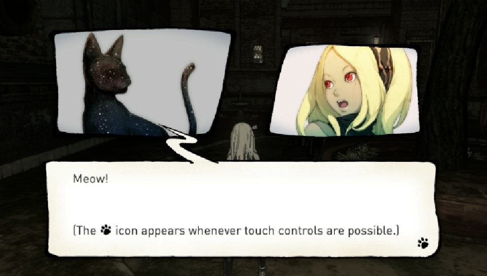
The way the cut-scenes are done is a manga/comic-book style. It is done with multiple layers so that when the system is tilted the plane the images are on moves so there is some dimension to the images. I feel more immersed when I swipe the screen, like turning a page, to progress the story.

The game is very much on rails for the beginning portion and you cannot stray from the path. When story is being told the game takes all movement controls from the player and you have to wait until it tells you what is happening, sometimes this can feel a little dragged out.

The conflict of the game is between you and these dark creatures with glowing red orbs located in their bodies. You (the character Kat) do not know who you are and all you know if that you have a power to control gravity with help from your black cat. There is also another person in the world that has this power so you are also pursuing them in hopes of learning who you are.

The First Enemy Kat Encounters, It Is Tearing Apart the Buildings and Ground, Sucking In Everything.

The Cat Companion That Helps You To Control Gravity, There Seems To Be Some Kind of Bond Between Kat and This Black Cat.

Mysterious Girl Named Raven Who Also Has An Animal Companion and Gravity Controlling Abilities.


The core mechanic of the game is the control of gravity. You press R to start floating in the air (along with those around you, which is entertaining) then place the blue circle in the middle of the screen and press R again to activate gravity to draw Kat in that direction. You can stop mid-air anytime by pressing R again and normal gravity can be restored with L. Normal gravity also is restored when you run our of energy.

 Controlling Gravity.

GUI For Energy On The Left.

That brings me to one of the core resources of the game, the energy that deplete as you control gravity. There are also resources such as crystals and health but the core mechanic relies on the amount of energy there is and how long your power is activated. You can engage in combat mid-air as well, zooming towards them and kicking them in their weak point, the glowing red orbs in their bodies. Zooming around and controlling gravity can get quite disorienting. The GUI has red arrows for where enemies are relative to your front facing direction but it can still feel like you are moving too slow. After time I am sure it becomes more intuitive, they also added the visual queue for which way is down with Kat's hair, it is always pulled down towards the ground with normal gravity.


The GUI on the screen is relatively minimal, which is necessary with such a small screen (5") and the reliance on seeing as much space as you can. 

Life Gauge On The Left.

Crystals Collected for Upgrades/Repairing the World/Etc.

 Always On Screen GUI Elements, Minimal.

The menu system is pretty simplistic as well, with just enough depth to let you know that as the game progresses you will receive very useful rewards.

The Game's Map.

Settings/Options Menu.

Skill Menu, Upgrade Skills By Spending Crystals You Collect While Flying Around The World And Completing Some Tasks.

The map lets you set a "Navi" point that the game will direct you towards with arrows. There is also a form of "fast travel" through the sewers, which is where your home lies as well. Overall the map looks clear and if points are close together the game zooms in when you tap and divides them more to make sure you are picking what you mean to. This is a nice solution to the "sausage finger" issue, well anyone's finger accuracy may not be spot on.

So far I have enjoyed Gravity Rush and its mechanics. The world is great and the focus on 3-dimentional space in the world feels fresh and unique. It is definitely a mechanic that encourages exploration and I found myself seeing what I could and couldn't do in the time I controlled gravity. There are some drawbacks but they are mostly my error, but I think they were preventable. If there are any obstacles near your trajectory when activating gravity towards a far wall or enemy then you stick to that surface and suddenly stop as your energy continues to deplete. I found myself stuck to fences and small objects slightly in my way a few times. Slowed me down in some challenges and trying to collect far away crystals.

After playing Gravity Rush for a couple hours I am intrigued and will definitely be playing more of the game. The mechanic is unique and the design feels appropriate for a handheld system.

The Gravity Rush "World".

~Will N.
(All images are Screen Captures from in game, property of their respective owners)

Analysis of Risk Board Game


Above is a picture of our game in progress. The version of the game we played was "Library Risk Game Set" which has the same rules as the original version of the game.
http://www.kidazy.com/products/risk.jpg
(image of the box and the game board)

Risk
It is very evident that risk is not the type of game to be completed in two hours. When I played the game it was against three other teams (four teams of two people, the maximum amount of players is six... Which of course we exceeded). All of us were unfamiliar with the game's rules or had not played it in a very long time. This is a great thing for students wishing to analyze a game with a critical eye, the first play through of a board game brings up a lot of murkily defined rules within the game.

The game board is designed well from an interface standpoint. Each continent has its own hue with the separate countries/areas in each continent clearly marked with their own shade/tint of the continents hue. There was no confusion when identifying the boarder of any given area and defining water versus land. Another nice interface design choice was the color coding for each army. This version of the game has square wooden blocks that represent one part of a players army. There are also slightly larger odd shapes that represent five parts of an army, in case an area with a lot of one players army is getting cramped, good foresight. Overall, the design is very simple and quickly comprehended.

The rules on the other hand were a little more in depth than we expected. Due to the assumptions made by all of the players in our game, the rules we unintentionally altered. For example, we played with the rule that "once an army in one country has attacked, it cannot attack again this turn". This inevitably slows down an already lengthy game but made players chose carefully whether to attack or not.

Some of the smaller areas of the map seemed cramped for three or more army pieces to be placed, a larger game board may have been nice for this reason.

After playing for a little under two hours, I am able to make some observations based on my lack of previous Risk knowledge and going by what I learned about the version we played. The game is definitely geared toward the Killer player type (referring to Bartle's "Players Who Suit MUDs". The mechanic of the game is to act upon other players and beat there army. There is plenty of room for players interacting with other players so Social gamers will enjoy the game as well. There is little/no interaction with the world itself so a lot of the appeal Adventurers and Achievers look for is not there.

The amount of strategy to the game is great and adds a lot of depth. It can feel a little hopeless at times when you feel behind but if you go with a strategy that the game fosters and plan ahead, then you should at least survive.

After playing this version of Risk, I got to play the digital iOS version on an iPad. It had the same general board interface but with a touchscreen instead of physical parts. The game seem to play a little quicker after the start. The way the designers handled digital dice was a little strange but made some sense. Each player could roll every attack or they could hit a button that rolled until the attacker won the territory or lost all but their last unit. This button was deemed the "Steamroll" button by our group because most of the time it lead to a victory and without the visual element of every dice roll it felt instantaneous.

Overall, I really enjoyed Risk and its decision making system, army allocation, and strategy elements. While I would not pay over couple dollars for the digital version, I would more likely purchase it over the board due to convenience and the same game design but in 2D format. It is nice to not have a large box for the game and just use up a fraction of some Flash storage.

~Will N.